Since the last update to the user interface released in 2015, we’ve added more options and functionality to each feature, impacting consistency and visual hierarchy. And given that it was released a decade ago, the look and feel of PocketSmith was certainly dated, as mentioned in recent reviews.
Overhauling the UI in a product with so much history is no small task, but it’s also a delicate balancing act between improving usability and aesthetics without inciting a user revolt! This is why you’ll see a real incremental approach to the PocketSmith web app redesign with a framework in place to iterate often. For this first stage, it was essential to laser focus on the areas of the application that everyone interacts with daily — primarily the toolbar and sidebar.
This blog post will discuss our goals in the redesign as well as the changes you’ll see in the application. But never fear, all the old functionality is still there and nothing has been removed or buried behind layers of convoluted menus.
Jumping back to 2015, Material Design was fresh, and focused heavily on flat design, with bold colours against muted, minimal environments (and we can’t forget the emphasis on real-world elevation!).
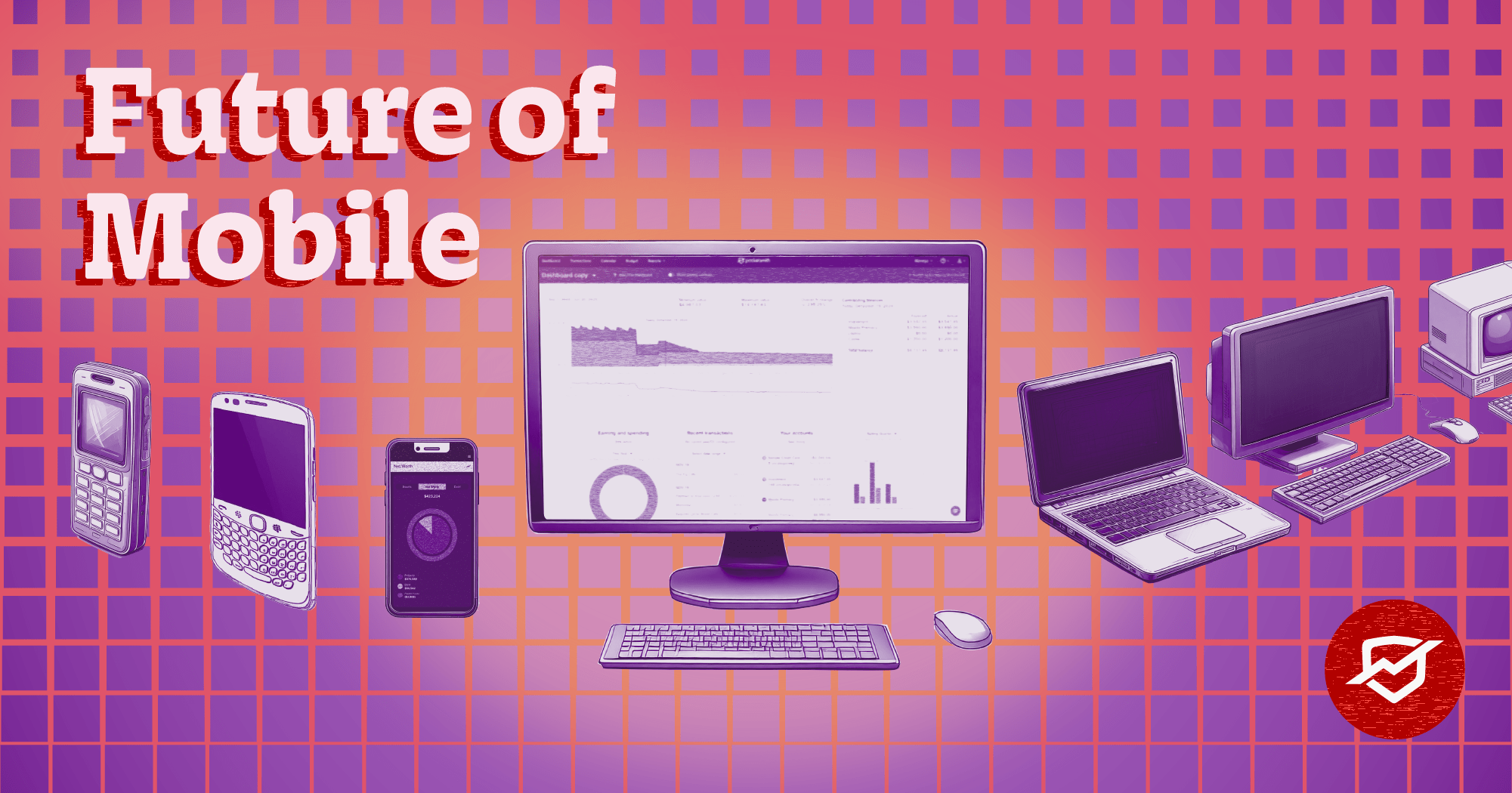
A lot has changed since we farewelled Parks and Recreation, and we wanted to bring PocketSmith into the modern era with a look that more aligned with what we like to see in the software space.
Form must follow function though, so more crucial than just a lick of paint, we needed to introduce better organisation of elements on the page. PocketSmith has a lot of options within the user interface, with toggles and selectors appearing throughout. The new design moves us closer to a logical consistency for:
There is still more to do though — for instance, the Net Worth report still has toggles in the toolbar. We are working through a plan for the pages that are lagging behind though, and this will enable us to put view toggles in the sidebar where they should be and reserve the toolbar for page actions.
The hierarchy of the page was a crucial factor in the new design — you want to see and interact with your data first without visual interference from buttons and headings! Font weights, colours, corners, shadows, and the layering of elements have been applied with real consideration for their importance and the flow of information and movement.
We’ve also improved how we use vertical space. For example, on the Transactions page you’re able to see more transactions at once, and through a reorganisation of the individual elements into spaces which honour their relationship more accurately, your view is less cluttered.
Throughout the application, you’ll see a new look for the toolbar, sidebar, and the way that the content is positioned within the page. Everything has a softer edge, and shadows have been carefully deployed to give context and a sense of depth.
All pages that have a graph along the top now expand the full width of the page, no longer being restricted by the sidebar. This leads to a much more comfortable scrolling experience, where the sidebar is always adjacent to the main content, and elements stay more consistent from left to right across the page.

The new user interface — reorganised, clearer, logical.
We’ve also tweaked how the messages appear on the lower left-hand side of the screen. This is often important information that people miss because of their previous design, tucked well away in the bottom of sidebar. These have been pulled out and made bolder so that important notifications about the actions you’ve performed are not missed.
A result of the above changes is that the Transactions page feels much cleaner, with fewer competing angles. We’ve tidied up and consolidated the page title bar, meaning the new beta search bar can sit cosily within.
The Transactions page with the old UI, as of yesterday.
The Transactions page with the new UI, with the exact same things selected. Bliss!
We’ve moved the summary of transactions to the sidebar, where you’ll also find the transaction counts along with the sum total statistics that used to exist above the transaction table. This aligns with the logic of collating view information and functionality together in the sidebar, and creates more vertical space for scrolling transactions!
The graph selection controls have been separated from the search controls as well, giving them a better sense of place and clarity in the toolbar.
The design changes mean that the Calendar has been brought back front and centre. There is now a clear summary of what you’re viewing on the calendar on the top left of the sidebar and all toggles have been moved to the sidebar as well.

The old Calendar UI, forcing your eyes to jump from top-to-bottom and left-to-right.

The new Calendar UI — horizontal calm, and a tidy summary of what you're looking at right at the top of the sidebar.
Grouped account management in the sidebar has also been significantly improved, replacing the obscure three-dot menu popup that was there previously. A toggle appears on the right of each item in the side, which expands to allow easy control over which scenarios and accounts are shown within the calendar. I think there may have been a collective sigh of bliss from the whole team for this change!

The way things were, multi-selecting grouped accounts via an obscure three-dot menu.

And now, with a fold-down and a clear indication that you don't have all accounts displayed in the calendar.
Pages now feature a summary at the top of the sidebar that responds to changes when different view options are selected. For example, when you land on the Budget or Trends page, you’re able to very quickly see exactly what you are analysing at any given time.

The Trends report within the new UI.

The Income and Expense Report within the new UI.
Some pages are still undergoing work, however we wanted to ship the improvements we’ve refined so far so we can iterate from a place of real-world experience. For example, the main Budget page has significant space available in the sidebar still, which lends itself well to restructuring how the information is displayed on the page. Likewise, the newer Net Worth page doesn’t yet have a sidebar, which means that the toggles still sit in the toolbar area, which will be resolved in later iterations.

Before 2015, everything in PocketSmith was brown. This theme still has many, many fans.
And lastly, we couldn’t spruce up the UI without a nod to our fine friends of PocketSmith from the Skeuomorphism era. Our brown legacy theme has been updated to ensure the new sidebar and toolbar changes are consistent throughout.
Overall, this release represents a major step in a new visual identity for the PocketSmith web app, with more exciting work to come. This agile approach to redesigning the user interface allows us the framework to grow and improve alongside the space we occupy without the paralysis of a right-first-time rigidity.
We hope you enjoy using it as much as we do!

Mindy came to PocketSmith from a fashion and print background and has been immersed in digital design ever since. When not fussing over pixels, she can be found sewing, fermenting or trying to convince her daughters to help her in the garden. She loves to use PocketSmith to responsibly enable way too many hobbies.